Case Study: Sit Conmigo
Yolanda Lopez, the owner of the ethical and sustainable chair company Sit Conmigo, was looking for a new website in preparation for the launch of her new chair collection, in order to promote interest in and allow customers to pre-order the collection.
Role
- Web designer
Deliverables
- Responsive website design
- Color and typography
Tools
- Adobe XD
Yolanda’s Goals and Priorities
- Attract aligned clients by showcasing her sustainable, ethical, and fair trade and fair labor practices in her branding
- Promote interest in her new chair collection and encourage customers to pre-order
- Encourage mobile browsing with a responsive web design
The Process
Branding
Yolanda is passionate about her impact on the world around her, which inspired her to prioritize sustainable, ethical production and the positive impact it has on both the planet and the people who work for her. Understandably, she wants this to shine through in her website – it’s a major selling point for her chairs that easily justifies the increased cost over similar chairs produced less sustainably or ethically.
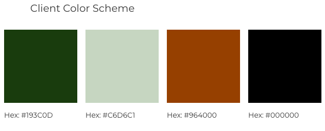
Yolanda specifically asked that the website not overshadow her products, so I picked a pale sage green background color that would bring to mind plant life and Yolanda’s focus on the environment without being too vibrant. I reinforced it with a dark green secondary color and a terra cotta orange accent color for an eye-catching call-to-action inviting customers to preorder her chairs. I also ensured that the three colors were accessible in all color combinations in the design; while accessibility was not a part of Yolanda’s brief, an inaccessible website would undermine her fair labor message, so I prioritized a high-contrast, accessible color palette.
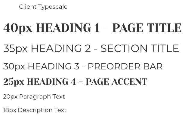
Yolanda had provided a logo, so I echoed its clean, smooth lines in selecting the sans-serif font Montserrat for the body text. Its consistent line thickness, kerning, and spacing would bring a note of dependability to the design. I paired it with the serif font Yeseva One for headers and branding – the mix of chunky and thinner strokes within letters and occasional small flourishes reinforce the dependability of Montserrat. The final font pairing is steady and reliable, leaning on tradition but unafraid to take a bold step in the right direction, and perfectly encapsulates Sit Conmigo.
Wireframe creation
I began the design with an eye-catching, terra-cotta orange floating header, inviting customers to pre-order a chair, which would stand out against the sedate green background and prime customers to make a pre-order purchase further down the page. This leaves room for an image slideshow on the first screen, which further builds interest by showing off some of the designs. It also introduces Yolanda herself without taking focus away from her designs. An About section below the slideshow introduces the brand and its values, further building identification with and interest in the company.
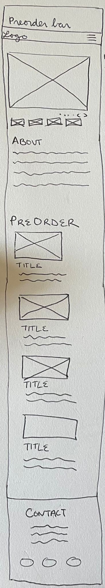
The mobile wireframe sketch
I prioritized large images and minimal text in the Pre-order section, hiding further details and the price behind a link, in order to keep the focus on the designs. This also forces the customer to make a small commitment – clicking on the button – to learn more, which reduces the commitment of preordering the chair and thus smooths the way for a sale. I then closed the design with a minimalistic Contact section that provides necessary information while keeping the customer’s focus on the chairs themselves.
For the tablet design, I expanded the image slideshow to take up more space, increasing its visual impact as customers navigate onto the page; the About section remains below, filling the width of the page.
The Preorder section images move into two columns; with the larger image size allowed by the tablet, this doesn’t reduce the impact, but rather increases the chance that customers will see all of the designs while scrolling, and thus makes them more likely to be caught by one and make a purchase.
Finally, the Contact section also moves into two columns, leaving the Preorder section still firmly on the screen while viewing the Contact section and thus increasing the chance of a sale.
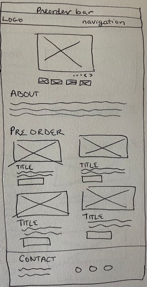
The tablet wireframe sketch
For the desktop design, I moved the image slideshow and About section into the two column layout seen in the other sections. This ensures that customers see the image slideshow first as they navigate to the site, which will draw them in without overwhelming the page or distracting from the preorders below.
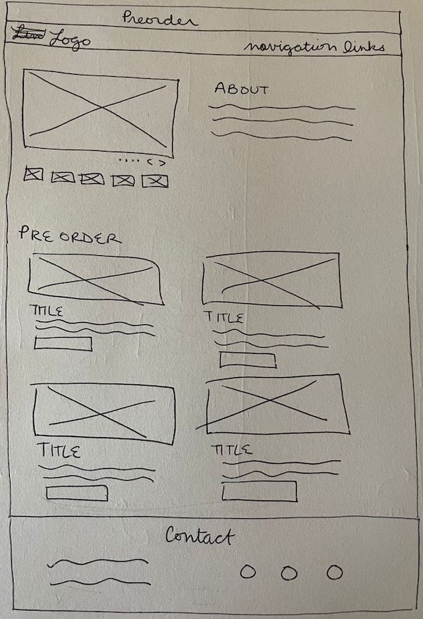
The desktop wireframe sketch
Design comps
To create digital wireframes, I imported the pen-and-paper wireframes into Adobe XD and created a low-fidelity version of each sketch.
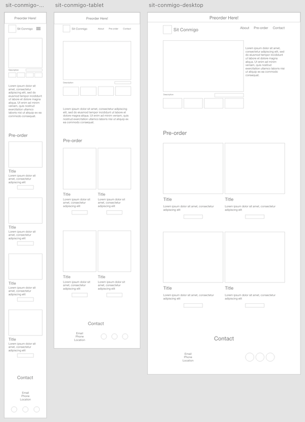
I then added the design elements to the page, starting with the mobile design. Adding the images immediately revealed an unexpected issue that forced me to reconsider my approach – when I’d generated the placeholders for the images, I hadn’t taken into account the images themselves. The most restrictive image was tall and narrow with a white chair covering the entire width of the image, so I resized the placeholders around this image’s proportions to ensure that all images would fit seamlessly into the slideshow.
Once the mobile design was complete, I duplicated it to create the tablet and desktop designs, to ensure consistency and a smooth transition between the page sizes. Finally, I reviewed the design for look and feel, accessibility, and accordance with the brief, and then sent the final design to Yolanda for her review and approval.


Project conclusions

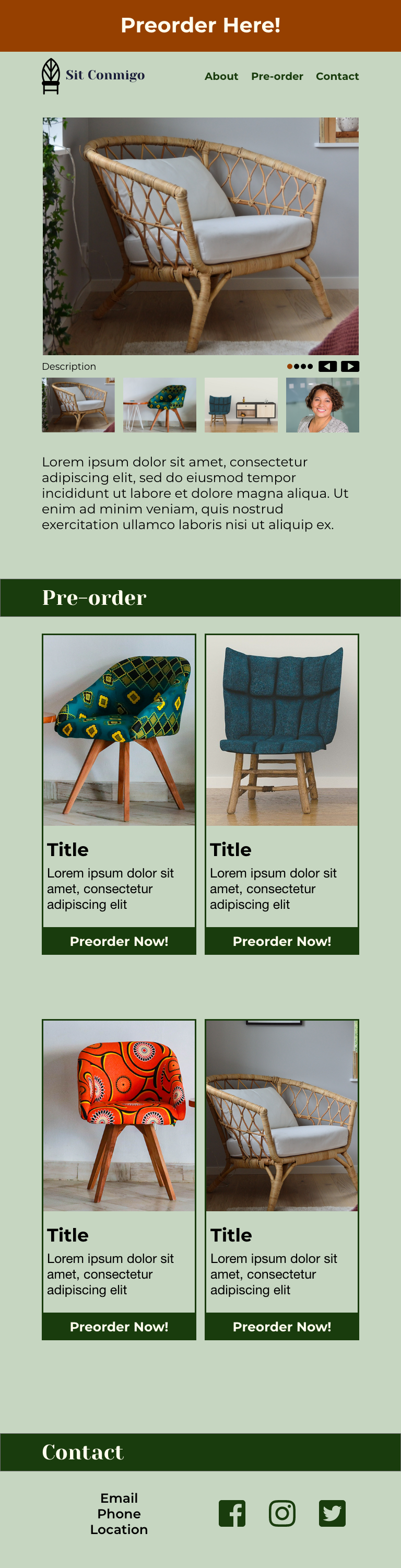
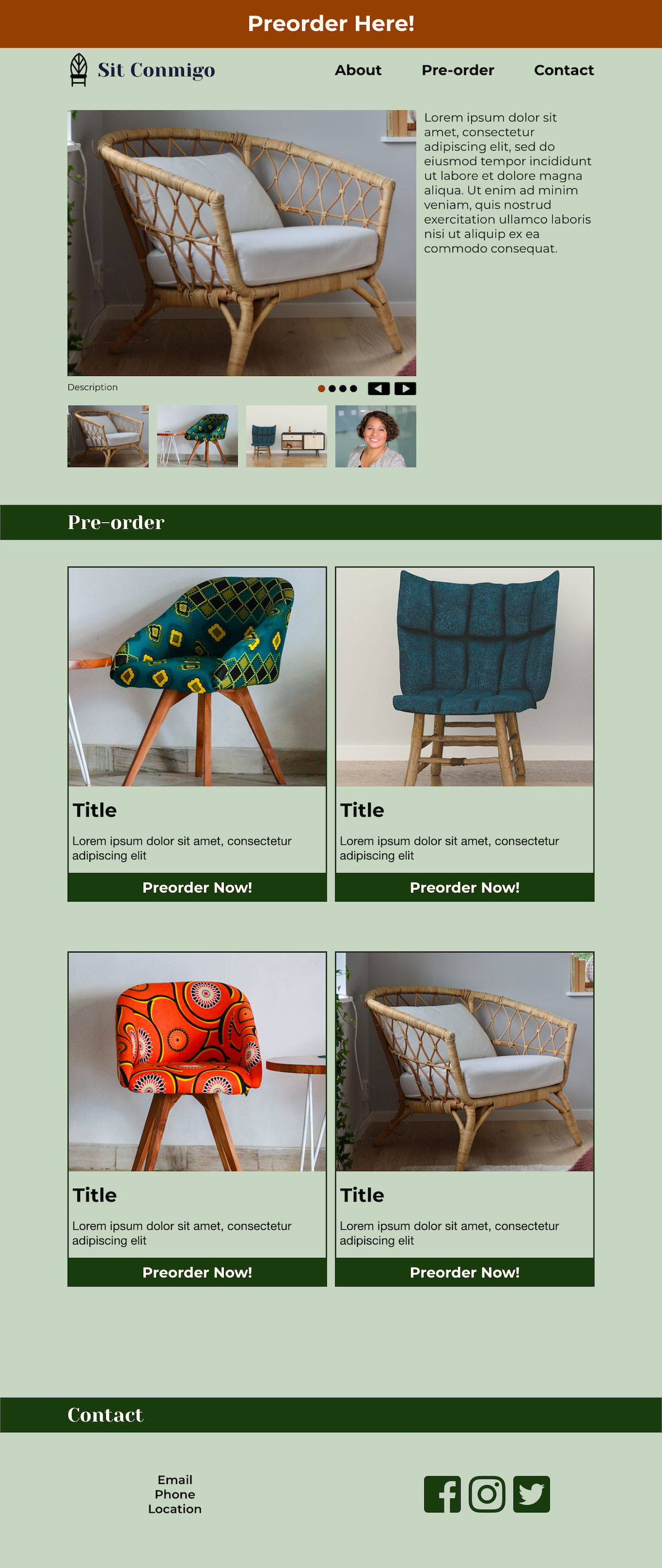
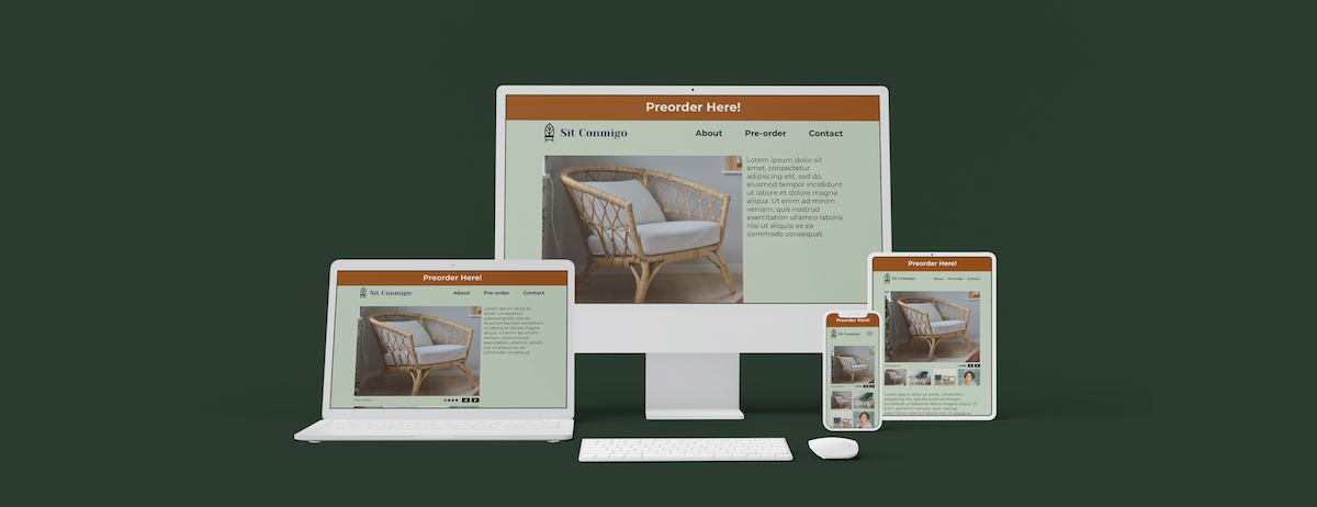
Final mobile (left), tablet (center), and desktop (right) designs, in standard ratios – scroll to see the full design, click to open the design in a new tab
Challenges
Because I based the image placeholders on what looked good and fit with the design, not on the images themselves, the placeholders didn’t show off the images’ subjects as well as they could or should. I solved the problem by leaving behind the original placeholder proportions and developing new proportions that showed off the most restrictive images’ subjects. In the future, the best solution is to determine the best image proportions before creating the digital wireframe, but that requires having the images early in the design process; if the images are not available at that stage or if they change during the design process, the technique I used allows for an existing design to be modified to fit the new images with minimal delay.
Conclusion
The website design brought the client’s brand to life, showing off her chairs to their advantage and enticing site visitors to preorder. The client was very happy with the design, feeling that it met all of her needs, and she passed the design on to her developer so she could start sharing her chairs with the world.