Case Study: The Whole Bean
Karla Kahvi was opening The Whole Bean, a coffee shop in a popular neighborhood of her small town. She needed a brand design both for the launch and for the shop’s lifetime that would help connect her to the community and attract her ideal customers.
Role
- Brand designer
- Graphic designer
- Accessibility expert
Deliverables
- Brand personality
- Mission statement
- Color palette
- Font pairing and typography guide
- Logos, graphics, and stock images
- Social media headers
- Complete style guide
Tools
- Adobe Photoshop
- Adobe Illustrator
- Adobe InDesign
Karla’s Goals and Priorities
- Build a brand identity that fits with her products and the neighborhood to help her attract her ideal clients
- Pair small-town intimacy with a sense of global responsibility
- Create brand imagery that will help launch her business and continue to support it throughout its lifespan
The Process
Project goals
Karla was especially interested in connecting with the community and fitting in with the neighborhood’s vibe, and I was hired to create an identity design and associated deliverables to help with that. Right away, I knew that this shop’s identity would need to balance and speak to two different values. Firstly, the shop would need to channel the warmth and openness of a locally-owned, small-town business, and really make everyone feel welcome and at home from their first interaction with the brand. Secondly, the name “The Whole Bean” really spoke to a sense of global responsibility, sustainability, and ecological connection.
Brand identity
If The Whole Bean is to succeed as a brand, these two values would need to come together seamlessly to create a single identity. Knowing both small-town culture and sustainable/eco-friendly culture, I immediately leaned towards a brand personality rooted in sincerity, one that radiated authenticity and was rooted in a desire to create connection with both the community and the world as a whole. The Whole Bean’s ideal customers would then be people who were often choosing between supporting locally-owned businesses and shopping with businesses outside the community that had a sustainable, eco-friendly focus; setting The Whole Bean up to fulfill both of these desires would make it a natural choice for these customers, as well as those who prioritized one over the other.
To bring that personality to life, I based the color scheme around a bright, golden yellow and a yellow-orange saffron, a pairing that would bring a warm, open energy. A yellow-tinged green brought to mind growing things and reinforced the brand’s global focus, while also forming an analogous color scheme that would bring some harmony and peace to the otherwise-energetic palette. A deep, warm brown rounded it out, grounding the brighter, lighter colors while evoking a down-to-earth, trustworthy feeling and, of course, coffee beans. With this color scheme, The Whole Bean would be a warm, friendly place, the sort of coffee shop that invites customers to find a table and stay for a while.

That was the energy I was looking to showcase as I pulled together brand images. I prioritized warm sunlight and colors, comfy and gently worn chairs, and bright greenery to create a cozy, almost lived-in space that would be naturally inviting. At the same time, I passed over photographs that appeared too cluttered or industrial; no one feels welcome to linger over their coffee when they can hear everything at the next table. Finally, I brought in The Whole Bean’s lifeblood: coffee and the people who drink it. I chose images from every stage of coffee’s life, from unripe berries on the branch to roasted beans to beautiful coffee drinks in people’s hands, to bring in a sense of connection to the coffee-making process and reinforce the sense of global responsibility that underpins this brand.


These images often featured rounded lines and swooping curves, and I mirrored that in selecting the main brand font, Ice Cream. A display font, it combines smooth, fat letters with delicately pointed ends to evoke warmth and comfort without falling into sweetness or insincerity. There was a little bit of a bite to it that I loved, especially when reinforced by the even lines and square corners of Karmina Sans as a body/small text font. The pairing brings an open, friendly tone with a straight-forward, sincere core running through it.

Bringing the brand to life
When it came to designing the logo, I knew that I wanted to lean more into the open, friendly aspects of the brand in order to create connection with customers and draw them in. My initial logo concept combined three components: hands holding a to-go coffee cup, with the fingers and thumbs of the hands forming a heart.

Two problems jumped out, though. Firstly, the hands couldn’t simultaneously hold the coffee cup, form a heart, and be easily recognizable as hands without raising questions that would just distract customers. And secondly, I didn’t like the coffee cup. Although a to-go cup was more recognizable than a standard mug, especially when half-hidden behind the rest of the logo, it evoked a grab-and-go mentality that just didn’t fit The Whole Bean.
I scrapped the idea of a coffee mug on the logo, but not entirely – I knew that a standard coffee mug would be the perfect icon to represent the menu and invite customers to skip the to-go cup in favor of sitting down and savoring their drink. I based the icon on a heavy earthenware mug with soft curves, a mug that would radiate warmth and be a pleasure to wrap your hands around, and then reinforced that comforting image by coloring the mug with the warm golden yellow shade and a subtle saffron gradient to create depth, and filling it with a dark, rich coffee brown. I then used this same color scheme to create a coffee bag logo to represent the products and remind customers that they can also savor The Whole Bean’s coffee in their own homes. A saffron panel gave depth to the yellow bag, and a brown label completed both the color scheme and the icon.
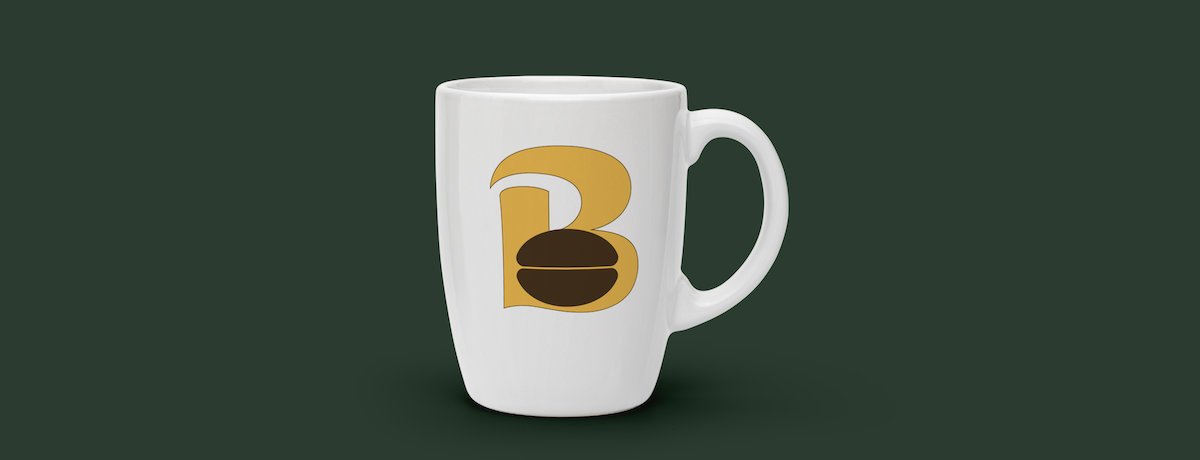
Returning to the logo, I sketched a few new designs, lingering on the idea of using a French press to evoke truly excellent coffee or a parrot to connect The Whole Bean more clearly with the rainforests where coffee grows, but neither quite fit a brand rooted in the community whose store concept specifically referenced drip coffee. In the end, the most authentic and sincere image to represent the whole of The Whole Bean’s brand was the simplest – a coffee bean. Keeping it simple leant the logo a down-to-earth feel and said that the reputation of The Whole Bean could and would stand on the quality of its coffee. Placing the coffee bean into the lower counter of the letter B in the brand’s main font and bright yellow color reinforced the brand’s warm, open personality and created an instantly recognizable logo. It also opened the door for a series of logos: I placed the simple B logo within the context of “The Whole Bean” to create a longer logo that would increase brand recognition with newer customers, and then created saffron and yellow-green versions of both logos, allow for some limited variation within the brand’s style.


The original yellow logo would be prioritized in branding, however, and it was a perfect social media icon, drawing the eye and immediately identifying the brand and its focus on coffee at a glance. I selected the straightforward display name and username of “The Whole Bean” and “TheWholeBean”, respectively, to allow for easy identification between the shop and the social media account. For the social media headers, I selected images from the photography collection that carried a sense of motion and life in them, images that would pull the viewer in and make them feel like they could be a part of the scene, if only they were at The Whole Bean.

Pulling all of this together into a style guide, I leaned on brand colors throughout to bring The Whole Bean to life for every person who interacts with it through the style guide. I created detailed instructions on how to use the fonts, logos, icons, and social media headers to maintain the cohesive and consistent brand style. And, anticipating that The Whole Bean would flourish, I included a guide for selecting new images that would continue to bring the brand to life for its customers and Karla alike.

Redesigning for accessibility
The project deliverables were ready to be shipped, but I knew that there was still one thing left that would hold The Whole Bean back from becoming everything it could be. If The Whole Bean was all about welcoming people into its warm, inviting heart, were they welcoming everyone, or were some people getting left out? I’d mentioned in the style guide that branding images should include people of all genders, races, and abilities, but I knew that those were empty sentiments if the branding itself excluded disabled people. It was clear: I had to pause shipping the deliverables to assess their accessibility and address any issues that I found.
The first step I took was to compare all of the colors to each other to see if they contrasted enough to be clearly legible and, while some combinations were safe, others were clearly a problem.

Looking at the patterns, my biggest concerns were that the medium green I had used for the style guide’s text and the yellow, orange, and light green I’d used for the logos and icons were all too light to be legible against the white backgrounds. I selected a darker shade of the medium green that had sufficient contrast against the white background and replaced all medium green text with the new shade, and then added the dark green to the color scheme as an accent color. I also added a thin black border around each of the swatches in the color scheme, to increase the lighter colors’ visibility against the white background.
To address the contrast issues in the logos and icons, I added a thin brown border to them; because the yellow, orange, light green, and white all had sufficient contrast with brown, the outlining provided the contrast necessary to place the inaccessible colors next to each other without sacrificing legibility or understanding. I then added the same outlining to the main brand font examples in the typography examples and the logos in the social media headers, and added a small brown bar behind the logo in the social media header images to reduce business and improve legibility and recognition.


Finally, I updated the brand guidance to codify the changes I had made and assist the client and all future users in maintaining the same level of accessibility. I curated lists of acceptable text and logo colors for each background color, allowing only combinations that were AA compliant at all text sizes. This would make it easy for all users to create consistent and accessible branding, and would reduce the risk of confusion over what fonts were big or bold enough to allow a lower-contrast color pairing. I also created examples of logos that, due to their background, were both inaccessible and hideous, in order to help users see why the brand guidance should be followed. Then, after proofreading and generating a final set of files, the deliverables were shipped to Karla and the project was complete.

Project conclusions


Challenges
I noted two major challenges during the design process. Firstly, while designing the logo, some of my original concept sketches failed to fully connect with key aspects of the brand’s personality, such as a to-go cup and a French press to represent a sit-and-savor brand that features drip coffee. My original sketch also featured a physically impossible floating coffee cup, which would’ve created more questions than customers. I realized I was so focused on the concept of the logo that I was failing to truly root it in the brand. Once I took a step back and designed from the brand up instead of from the logo down, the result was both a better representation of the brand and a far more evocative logo.
Secondly, the process of converting The Whole Bean to an accessible brand was rife with challenges. It was certainly possible to break down the accessibility challenges and address them both individually and holistically, but most of those challenges could’ve been avoided by assessing and addressing accessibility issues from the beginning of the design process. However, not all brands choose to prioritize accessibility when they’re just starting out, and it’s wonderful to see just how possible accessibility updates are.
Conclusion
The style guide and associated components were delivered to the client before the requested deadline. This allowed her to create everything she needed to establish The Whole Bean within her community before the launch, from signs and menus for the shop itself to social media accounts and advertisements that raised awareness and interest. Throughout the process, the style guide provided guidance for and cohesion to everything she created, supporting and reinforcing the branding and the brand through a successful launch and for years to come.