Case Study: CJ Buys

Mobile phone, laptop, and tablet mockups of a website featuring a succulent, all on a dark green background

WEB DESIGN

This design pairs one of my favorite images – irises in spring – with my intuitive, crisp, and accessible design style to show off who I am as a designer

Skills: Brand and identity design, color and typography, logo and business card design, responsive web design, accessible web design, web development

Tools: Figma, Photoshop, Illustrator, InDesign


The Project

Project overview

In order to introduce myself as a visual designer, I decided to design my own portfolio website to showcase my work and myself to future prospective employers. The design would feature my design projects and skills, a personal introduction, and a contact section, and the entire website would be responsive and accessible.

Project scope

Deliverables for this project included a brand personality, color palette, font pairing, set of logos, business card, and webpage, including designs for a main page and for a case study page. Deliverables were created using Figma, Photoshop, Illustrator, and InDesign, and the final webpage was coded in HTML, CSS, and JavaScript using Visual Studio Code, Git, and GitHub.

Project role

As both the client and the designer on this project, I worked to bring my own style and personality to life in a design that both showcased and featured my design work.


The Process

Project goals

As I pivoted my career towards working full-time in design, I knew that I would need a portfolio website to show off my skills as a designer to prospective employers. I also wanted this project to prioritize accessibility at every stage of the design process, because of my personal and professional passion for an inclusive and welcoming world, and to be filled with my personality, both as a designer and as an individual. The project goals thus included creating my own brand and logo, designing my website, and developing the final website into a functional design; I wanted my portfolio to be its own introduction to me and my work, not merely a vehicle through which to see what I can do as a designer.

Brand identity

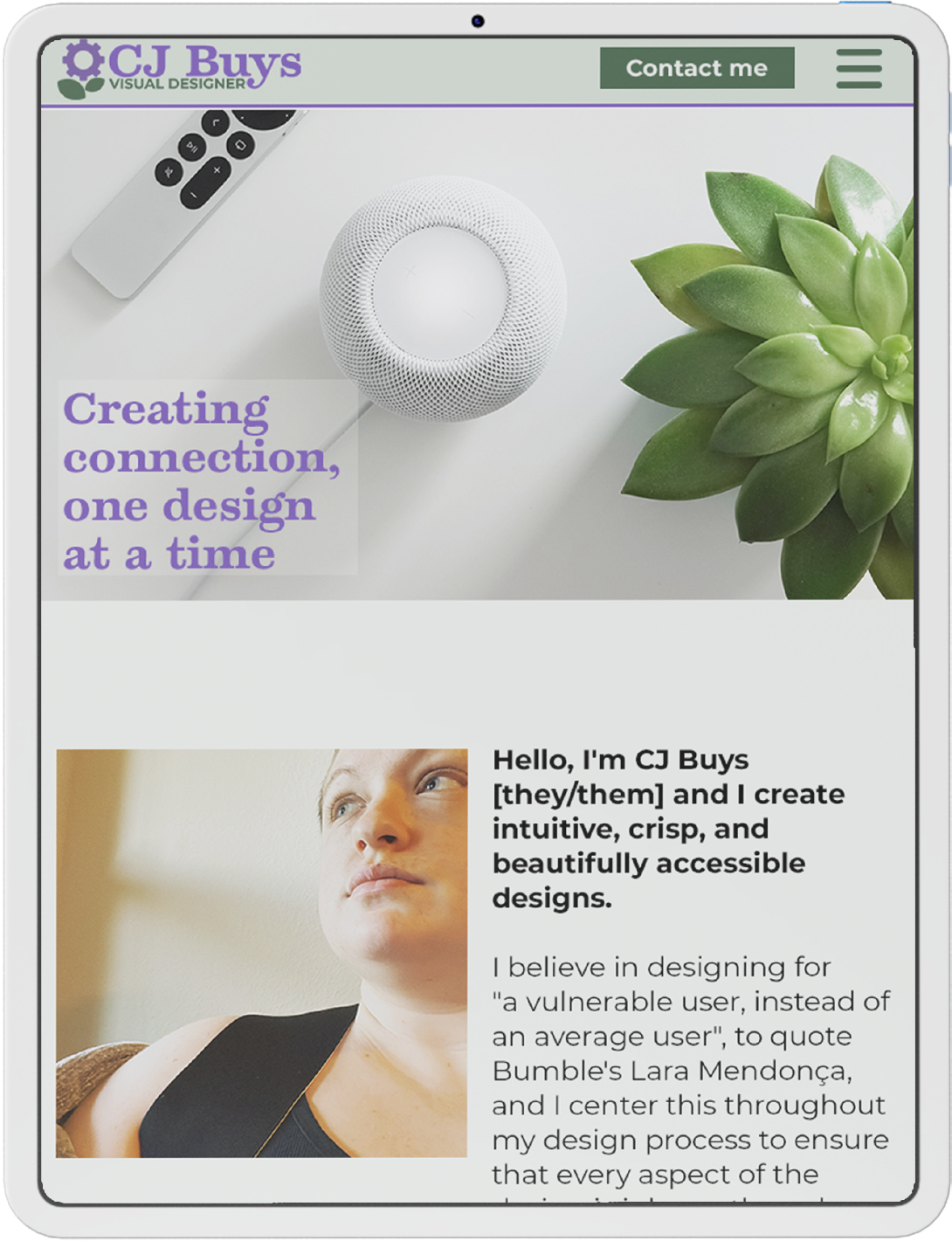
From the very beginning, I had an image of what my personal brand was that I knew would drive every aspect of the design. I grew up spending so much time outdoors, playing in the garden and going on long walks in the woods, and I’ve continued to be so in love with the natural world as an adult, so I wanted to bring an element of plant life to my brand. It would speak to who I was as a person, but would also lean into this theme of organic growth and connection building that is at the core of who I am as a designer – I design because I want to create an online world that’s accessible and welcoming for everyone, allowing us all to connect to, learn from, and grow with each other.

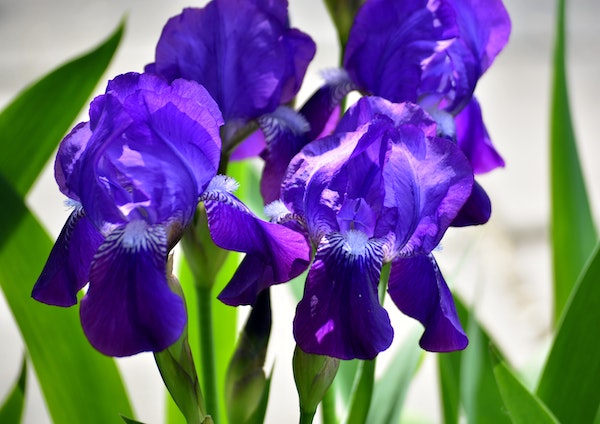
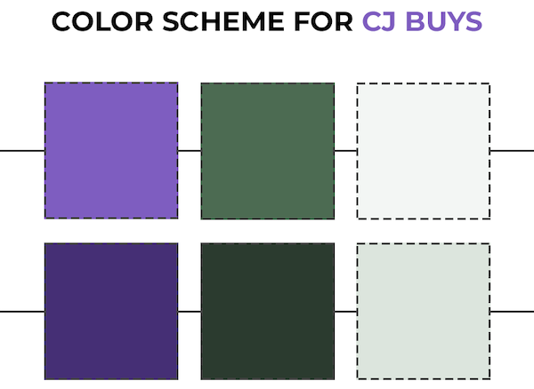
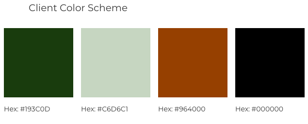
My color scheme inspiration came from a favorite memory of watching irises bloom in the spring. They’re such vibrant, quirky flowers, which is maybe why I love them so much, as the same can and has been said about me. The iris’s vivid purple would also speak to my creativity, which I believe is a crucial part of what makes a good designer; we need to be able to think outside the box, combining tried-and-true strategies with new ideas in exciting and evocative ways to bring our work to life. I hoped that this combination of purple and green would subconsciously bring these qualities to mind in my users when they saw them throughout my brand.

Vibrant purple irises against green leaves
An inspiration image by Volodymyr Tokar on Unsplash
A color scheme featuring bright purple, green, and green-white, as well as darker shades of each color
The color scheme for my brand

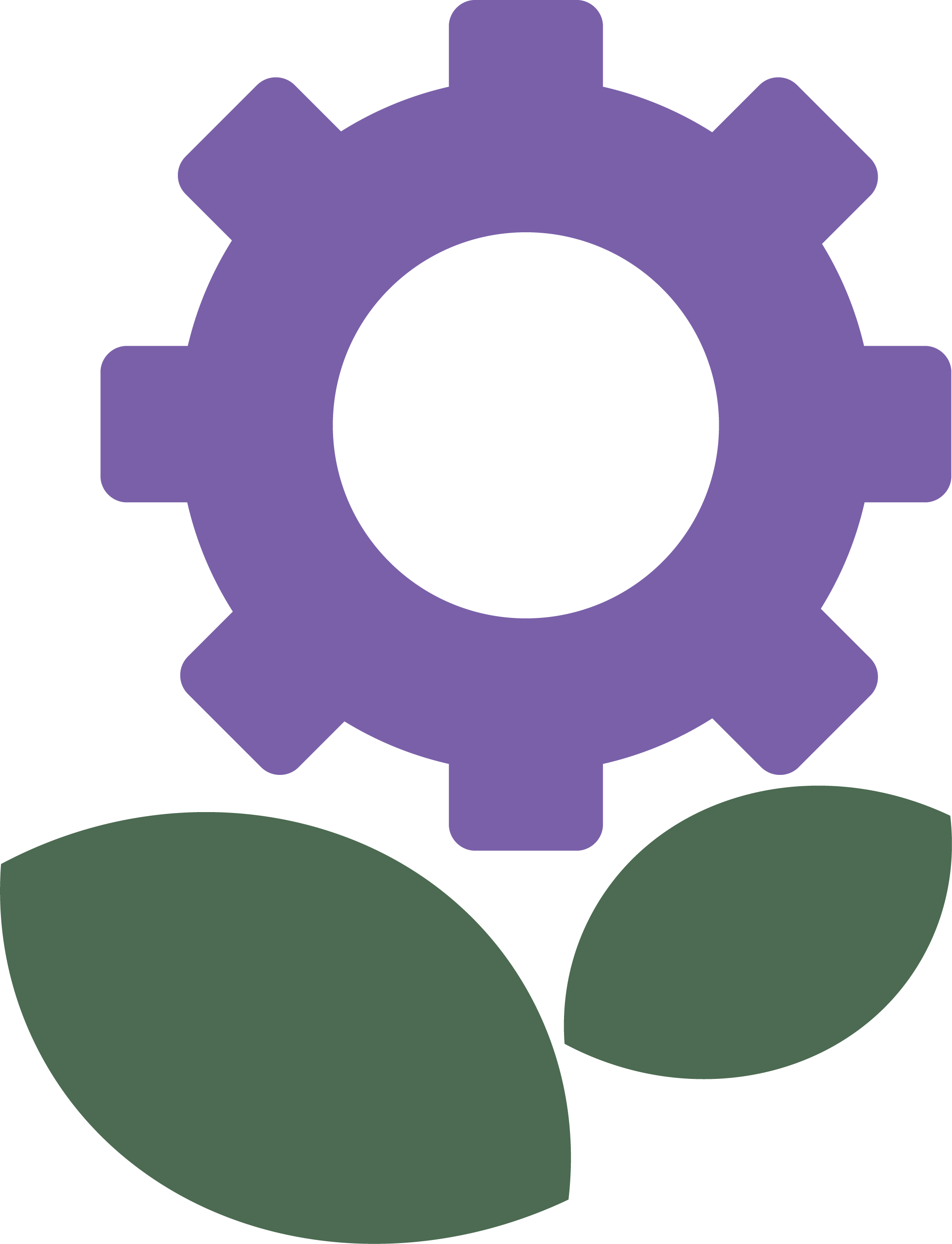
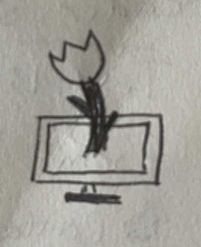
My initial logo design sprung directly from the brand imagery I’d been developing – I imagined a flower growing out of a computer monitor, really driving home the combination of technology and organic growth. But, when I started to create the logo in Illustrator, I found that I wasn’t as fond of the actual design as I was of the idea behind it. There were too many parts to it, and I felt it came across as more scattered and less cohesive than I’d been hoping it would be. I wanted it to be simple and evocative, something that was instantly recognizable, but this design wasn’t living up to that. I cut it back, taking out the monitor and the flower’s stem to leave just a blossom and leaves, and then switched the flower petals for a gear in the same purple; with the bright purple color against the green leaves, it was still clearly a flower, but the gear brought in a technological element. This new logo reinforced the brand identity I’d begun building with the color scheme with a simple design evoking both of my brand’s main themes, which was exactly what I needed it to do.

Logo sketch featuring a flower coming out of a computer monitor
Initial logo sketch
Initial logo featuring a flower on a computer monitor
Initial logo design
Final logo featuring a plant with a gear for a flower
Final logo design

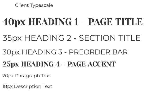
I also wanted to create a larger logo that would incorporate my name, so I started looking into fonts. I wanted to find a display font for my main brand font, possibly with serifs; I wanted it to be easily legible but also have beautiful curves and some interesting textural elements to give it character. I was initially drawn to Fredericka the Great – the letters were elegant and had enough weight on even the thinnest strokes, but had some gorgeous shading on the letters that caught my eye the moment I saw it. It was both rustic and stable, and I absolutely loved it. Once I started using it, however, I immediately realized that it wasn’t going to work – the letters’ shading was transparent, which made the letters hard to read in any combination that wasn’t pure black-and-white, so it just wasn’t accessible with how much color I wanted to use throughout my design. I started looking again and soon found Temeraire, an Adobe font with beautiful, clean lettering and gorgeous accents that combines reliability with a quirky creativity that’s very true to me and to my brand. And it was a perfect pair to Montserrat, sharing many of the same letter shapes with the clean sans-serif font that’s been a favorite of mine ever since I first saw it – I love how Montserrat combines beautifully consistent lines and slightly wide letters and kerning to make text so easily legible. This combination would be attractive and on-brand, and would create a great starting point for creating accessible text in my designs, including my complete logo.

CJ Buys flower logo with the text 'CJ Buys Visual Designer' in a non-accessible, semi-transparent font
My first logo attempt, featuring Fredericka the Great as a brand font, fell short of my accessibility goals
CJ Buys flower logo with the text 'CJ Buys Visual Designer' in an accessible font
The complete logo, featuring Temeraire Bold (brand font) and Montserrat (text font)

Finally, I combined the color scheme, logo, and font pairing in InDesign to create a digital business card that could also be printed for in-person use. I used the pale green accent color with black text to echo my planned website design and promote readability in all formats, and filled the top half of the card with my complete logo to draw the eye in. Finally, I placed my contact information on the right half of the card to create a dynamic, visually interesting design without sacrificing the legibility of left-aligned text.

A business card featuring my logo, the text 'CJ Buys Visual Designer', and my contact information
My business card, featuring the complete logo design

Website Design

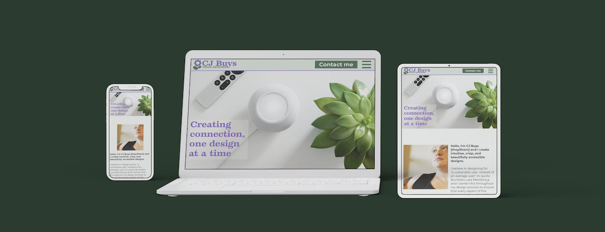
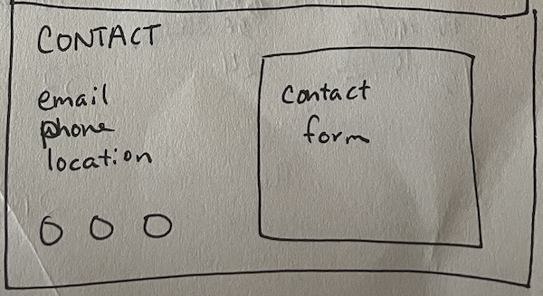
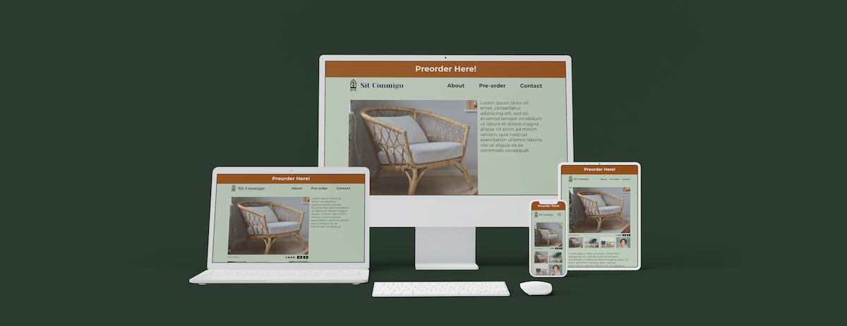
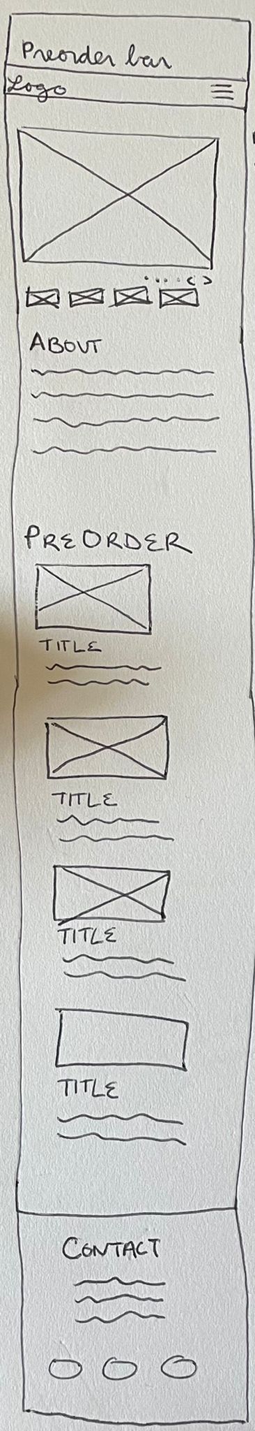
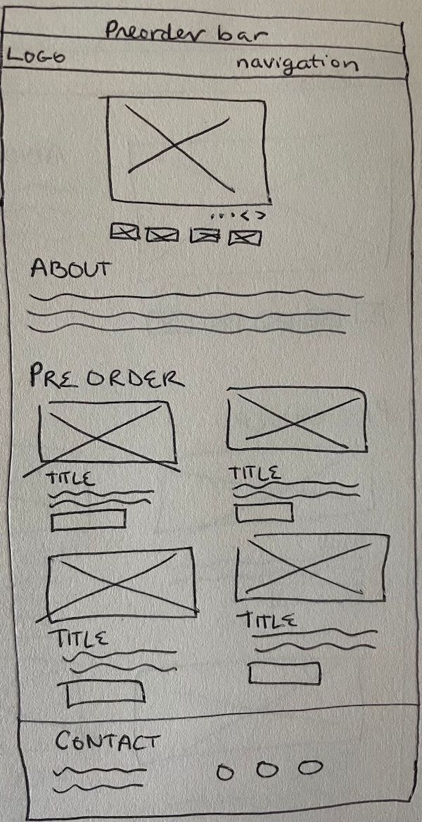
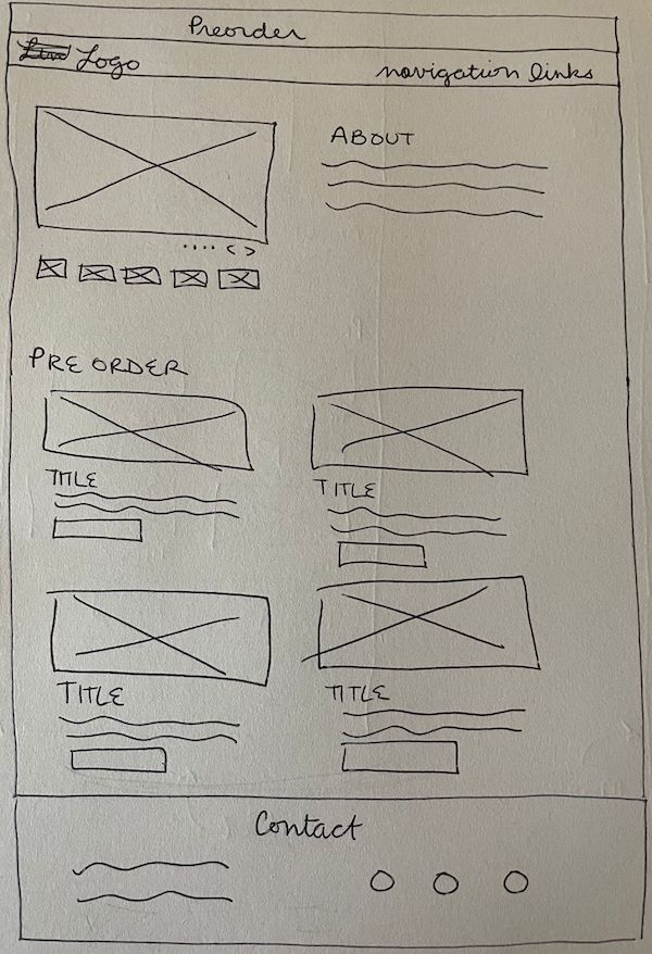
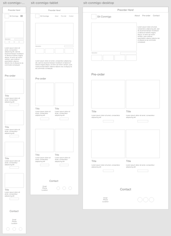
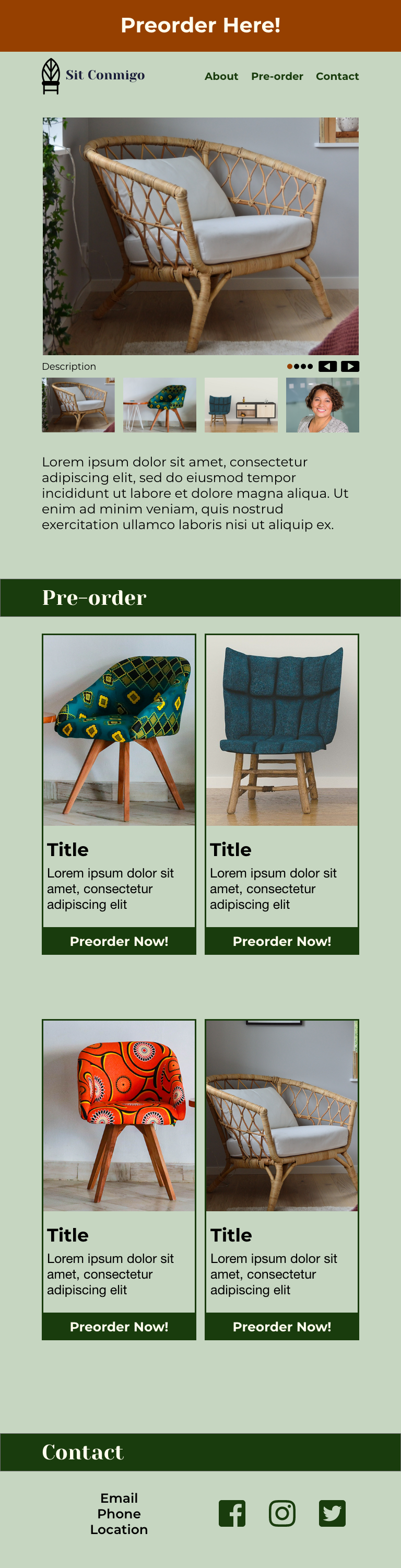
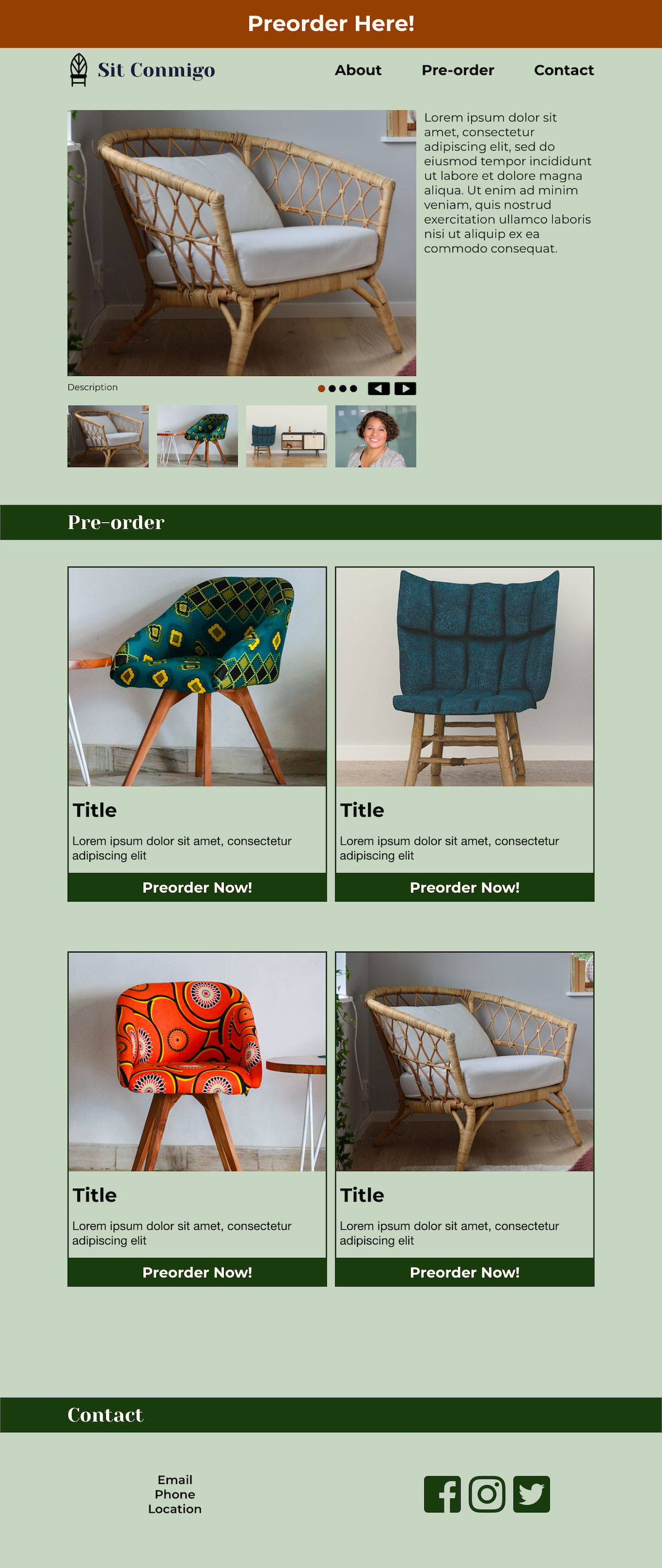
I started creating the website design with a pen-and-paper wireframe that featured five sections – a header bar with navigation links, an introduction with a full-width hero image, a work section with subsections for each featured project, an about section, and a contact section. I then started creating the digital wireframe using Figma, creating each section for the mobile design before editing them for the tablet and desktop design. I made several changes to the design during this process, including adding more space between sections, adding borders around the featured projects to differentiate them, and adding a basic contact form.

A paper wireframe of a section titled 'Work' and featuring a two-column featured project; one column is an image placeholder, the other has placeholders for a title, description and linking button
The featured projects section of the original paper wireframe
A digital wireframe of a section titled 'Header 1' and featuring a single-column featured project with a thin black border; the box includes placeholders for an image, title, description, and linking button
The digital wireframe’s updated featured projects section
A paper wireframe of a section titled 'Contact' and featuring a two-column layout; one column has placeholders for email, phone, location, and three social media icons, and the second column has a placeholder for a contact form
The contact section of the original paper wireframe
A digital wireframe of a section titled 'Header 3'; one column has placeholders for email, phone, location, and social media icons, and the other has a contact form with name, email, phone number, and message boxes and a 'Send me a message!' button
The digital wireframe’s updated contact section

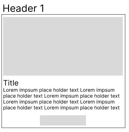
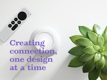
As I prepared to move the wireframe into Photoshop, I decided to focus on designing the mobile design, rather than designing mobile, tablet, and desktop versions simultaneously. I knew that perfecting the feel of the tablet and desktop designs would likely require some changes to the mobile design, but I also knew how much time propagating every change across the three versions would take, and was sure that this would be the most efficient design strategy. I created the mobile design from the wireframe and began fleshing it out with images and copy, including a stunning hero image and pictures of my designs. I decided against the blocky borders around the featured projects, feeling that it made the whole design feel very modular. Instead, I used circular images and centered text for a more organic feel, and added plenty of space between the projects to keep the design from feeling too tight or confused.

A photograph of a remote, speaker, and bright green succulent, overlayed with purple text reading 'Creating connection, one design at a time'
The new hero image, by Jeremy Bezanger on Unsplash
A round photograph of a website, a header reading 'Sit Conmigo Design', and a paragraph that reads: 'Modern design and an ecological theme come together to show off a sustainable, fair trade and fair labor chair company's new products'
The modified introduction to and sample of my design projects

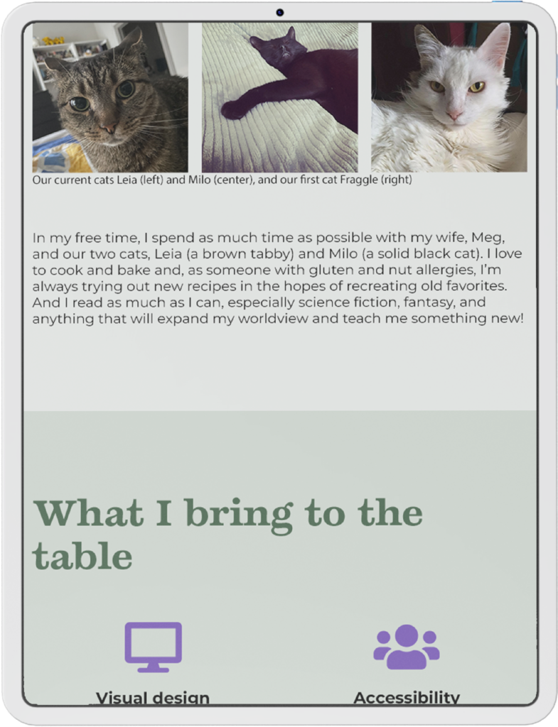
I also expanded the About section to include three paragraphs that would introduce users to my professional goals, passion for accessibility, and personal life. I’m a disabled, queer person and I use my experiences with both of these identities to inform my designs, creating work that’s accessible and welcoming to a wider variety of users because of those identities; they’re not just a huge part of my life, they’re also an asset to my work, and I want to work with people who also see them as assets. And, to prevent the section from becoming a wall of text, I added a few extra photographs, including images of my cats and my beautiful wife.

A 'Who I am' section featuring two columns. The first column features an introduction to my professional journey; the second column features two pictures of me, one including my house plants.
The expanded ‘About me’ section, featuring photographs two photographs of me and an introduction to my professional journey

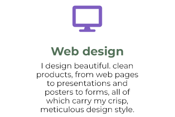
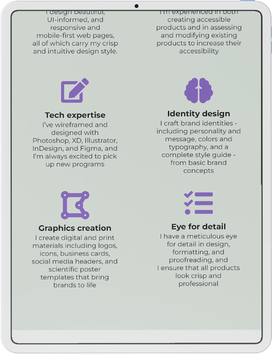
Being a good fit with a company or a client is more than just the work I’ve done or who I am, however, so I also added a new section to talk about some of my most important skills. I centered the skills and gave them a lot of breathing room to give the subsections a dynamic and open feel, but kept the text tight to promote readability. I then capped each skill with a descriptive icon in my brand shade of bright purple, to draw the eye and provide a quick visual introduction to the skill below.

A purple icon of a monitor, a subheader reading 'Web design', and a paragraph reading 'I design beautiful, clean products, from web pages to presentations and posters to forms, all of which carry my crisp, meticulous design style'.
The new skills section, accented by a bright purple icon

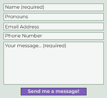
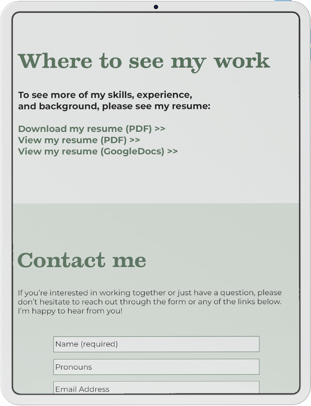
The contact form in my wireframe had been very basic but, as I fleshed out both the design and its personality, I started to reconsider whether that really worked for me or for my brand. I have a unique perspective as someone who uses they/them pronouns – I’m frequently misgendered, which can be very distressing, but I also find it awkward to correct people or to preemptively give them my pronouns. Culturally, it’s not something we’re very comfortable with, but why does it have to be that way? Each design is a chance to reconsider how we want to interact with the world and how we want our users to feel, and one of the easiest ways to create comfort around pronouns is to cut out the pronoun dance entirely and deliberately create space for pronouns. So, if I’m already collecting a user’s basic information in the contact form, why not also collect their pronouns? It gives me the ability to interact with my users in a way that’s authentic and comfortable to them, and it shows them my values and respect for them in a way that goes beyond just appearances.

A contact form featuring five boxes - Name (required), Pronouns, Email Address, Phone Number, Your message... (required) - and a purple 'Send me a message!' button
The updated contact form, featuring a new field to collect users’ pronouns

User feedback

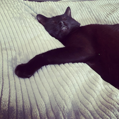
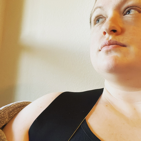
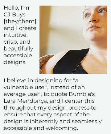
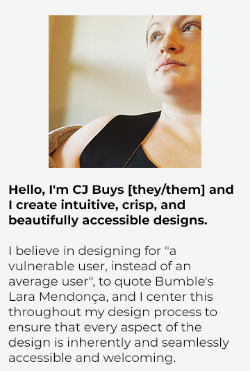
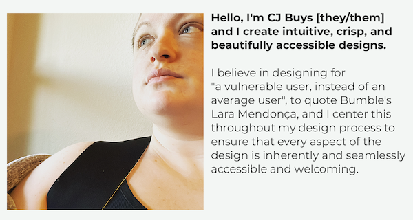
Having completed a first draft of the design, I reached out to fellow designers, non-designer small business owners, and others for feedback on the design, to ensure that it accurately showcased me, my personality and brand, and my work. One of the areas I’d specifically asked for feedback around was the selection of personal photos I’d included in the About Me section. The result was unsurprising – everyone’s favorite photo was of my incredibly adorable and photogenic cat, Milo – and I created a new introduction section at the top of the page featuring their favorite photo of me. This was also the perfect place for a quote that I’d seen in an article on Bumble’s product design that had caught my heart on fire. In it, Bumble’s head of product design, Lara Mendonça, talks about designing for “vulnerable users” instead of average users and, while she was talking about designing a dating app for women, that quote cut to the heart of why I center disabled people in my designs. Products designed for disabled users generally still work for non-disabled users, but the reverse often isn’t true. To make designs accessible to and welcoming for all, we have to center our most vulnerable users and their needs and experiences.

A black cat lies on a bed, spooning a pair of blanket-wrapped legs
Milo, one of our current cats
CJ Buys, a white genderqueer person, looking off into the distance
The newly-added introduction section, featuring my test audience’s favorite photograph of me

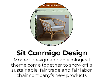
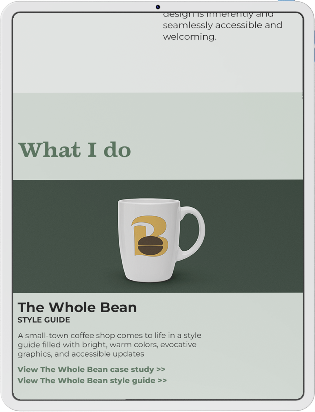
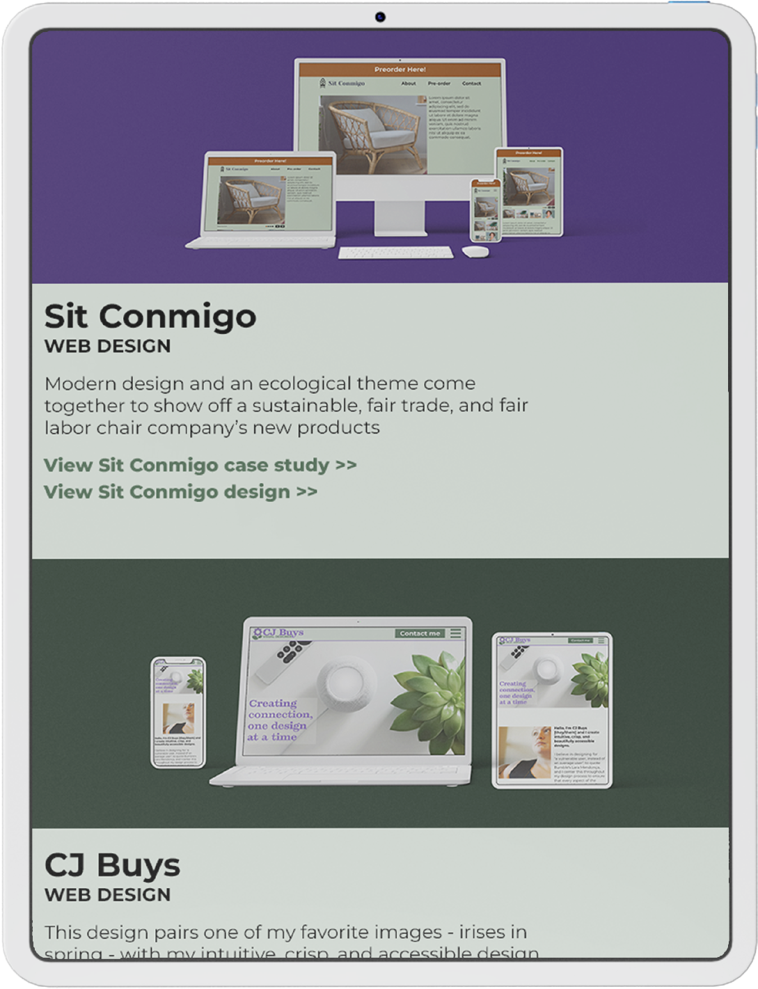
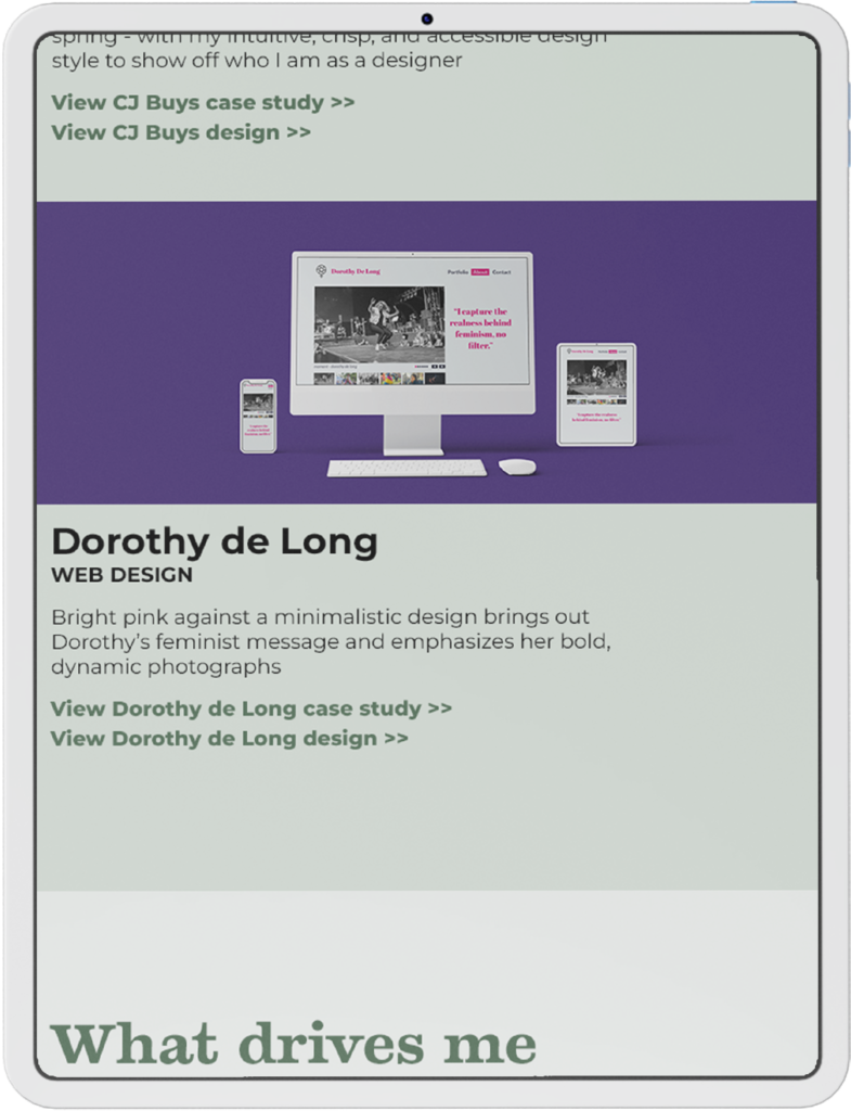
Simultaneously, I reviewed other designers’ work in order to see which of their techniques I liked and which would possibly work with my existing design. One of the design elements I fell in love with was using wide, dynamically colored backgrounds for mockup images to catch users’ attention and beautifully show off the designs. I decided to implement this, using a darker shade of the green from my logo for these backgrounds to make the white-framed mockups really pop. I also reformatted the projects section, filling the entire width of the screen with the mockup images to create organic breaks between the projects without the borders I’d rejected earlier in the project.

A white mug with a yellow and brown logo up against a dark green background. Underneath it is a header reading 'The Whole Bean', a subheader reading 'Style Guide', a paragraph introducing the project, and links to view the case study and style guide
The new project section design features a full-width mockup with a vibrantly-colored background

Finally, I created copies of the mobile design for tablet and desktop versions, and adjusted the formatting to fit the new widths. Early in the design process, I had made notes of the different typefaces – including font, size, line height, weight, and color – in order to create consistent styles across sections of the site’s mobile version. While creating the tablet and desktop versions, I used the first instance of each style to set the proper conversion, and then adjusted each subsequent instance to match, so that the website’s style would remain consistent between and within versions. I also adjusted the formatting of some sections to facilitate a smooth transition between versions. In the case of the introduction, I had originally split the text block into two sections, one beside the photograph and one underneath. On the mobile design, this was beautiful but, when I attempted to match this on the tablet and desktop versions, it didn’t have the same impact – at an appropriate size, the first block of text was either much shorter than the photo or was ridiculously skinny. I decided instead to place both sections of text together below (mobile) or beside (tablet and desktop) the photograph, and to bold the first section and add a small gap between the sections for emphasis, which preserved the flow of the design without sacrificing the readability.

The original introduction section formatting - the first sentence and the photograph are side by side, with the second sentence below them both
The original introduction formatting
The final mobile introduction section formatting - the photograph is centered above the text, with the first sentence bolded
The updated introduction formatting for mobile devices
The final tablet introduction section formatting - the photograph is to the left of the text, with the first sentence bolded
The updated introduction formatting for tablets
The final desktop introduction section formatting - the photograph is to the left of the text, with the first sentence bolded
The updated introduction formatting for desktops

Project conclusions

Final design mockup, image 1 of 9
Final design mockup, image 2 of 9
Final design mockup, image 3 of 9
Final design mockup, image 4 of 9
Final design mockup, image 5 of 9
Final design mockup, image 6 of 9
Final design mockup, image 7 of 9
Final design mockup, image 8 of 9
Final design mockup, image 9 of 9

Challenges

One of the biggest challenges of this design was acting as my own client, without a doubt. I had so many ideas of what story I wanted my design to tell and, the more I explored other designers’ work, the more ideas I had of how to bring that story to life. It was so tempting to go back again and again to adjust the formatting and styles, to add new sections, and to just fiddle with it all – and I’m certainly guilty of giving in to that urge! – but I knew that couldn’t last. As I’ve seen in every project I’ve ever worked on, as a designer and otherwise, there’s a huge difference between actually fixing problems or improving your work and chasing perfection. When I found that line with this design, I did a final check on the project, declared it complete, and started developing it.

This design also forced me to reconsider my design process. In the past, I’d designed much simpler projects and, while I’d gotten plenty of feedback as part of the design process, I’d never designed for an actual client with a real stake in every aspect of the design. My design process reflected that – I created mobile, tablet, and desktop versions of the design before seeking out feedback. While that worked in the past, I knew going in that that process wasn’t going to work for this project; there would be too many things I wanted to adjust and try out throughout the process, and constantly updating different versions would be incredibly inefficient. Instead, I focused on designing the mobile version and, once I was satisfied with that version, created the tablet and desktop versions from it. This required me to make small adjustments to the mobile version as I saw how the tablet and desktop versions changed the overall design, but the change paid off: it saved me considerable time and effort over the course of the design and, as a client, it would’ve saved me quite a bit of money.

Conclusion

After I completed this design, I began to develop it using a combination of HTML, CSS, and JavaScript, turning it into the fully functional webpage that you see before you today. This portfolio has become the backbone of my professional brand, allowing me to connect with prospective employers and clients and to show off both my work and my design process. If you’re interested in working with me or in any aspect of this design, please don’t hesitate to use any of the below contact methods to reach out – I’d love to hear from you.

Take a closer look

Case Study: The Whole Bean

A white mug with a logo - a yellow B with a coffee bean in the B's lower hole - on a dark green background

Karla Kahvi was opening The Whole Bean, a coffee shop in a popular neighborhood of her small town. She needed a brand design both for the launch and for the shop’s lifetime that would help connect her to the community and attract her ideal customers.

Role

  • Brand designer
  • Graphic designer
  • Accessibility expert

Deliverables

  • Brand personality
  • Mission statement
  • Color palette
  • Font pairing and typography guide
  • Logos, graphics, and stock images
  • Social media headers
  • Complete style guide

Tools

  • Adobe Photoshop
  • Adobe Illustrator
  • Adobe InDesign

Karla’s Goals and Priorities

  • Build a brand identity that fits with her products and the neighborhood to help her attract her ideal clients
  • Pair small-town intimacy with a sense of global responsibility
  • Create brand imagery that will help launch her business and continue to support it throughout its lifespan

The Process

Project goals

Karla was especially interested in connecting with the community and fitting in with the neighborhood’s vibe, and I was hired to create an identity design and associated deliverables to help with that. Right away, I knew that this shop’s identity would need to balance and speak to two different values. Firstly, the shop would need to channel the warmth and openness of a locally-owned, small-town business, and really make everyone feel welcome and at home from their first interaction with the brand. Secondly, the name “The Whole Bean” really spoke to a sense of global responsibility, sustainability, and ecological connection.

Brand identity

If The Whole Bean is to succeed as a brand, these two values would need to come together seamlessly to create a single identity. Knowing both small-town culture and sustainable/eco-friendly culture, I immediately leaned towards a brand personality rooted in sincerity, one that radiated authenticity and was rooted in a desire to create connection with both the community and the world as a whole. The Whole Bean’s ideal customers would then be people who were often choosing between supporting locally-owned businesses and shopping with businesses outside the community that had a sustainable, eco-friendly focus; setting The Whole Bean up to fulfill both of these desires would make it a natural choice for these customers, as well as those who prioritized one over the other.

To bring that personality to life, I based the color scheme around a bright, golden yellow and a yellow-orange saffron, a pairing that would bring a warm, open energy. A yellow-tinged green brought to mind growing things and reinforced the brand’s global focus, while also forming an analogous color scheme that would bring some harmony and peace to the otherwise-energetic palette. A deep, warm brown rounded it out, grounding the brighter, lighter colors while evoking a down-to-earth, trustworthy feeling and, of course, coffee beans. With this color scheme, The Whole Bean would be a warm, friendly place, the sort of coffee shop that invites customers to find a table and stay for a while.

The original color scheme

That was the energy I was looking to showcase as I pulled together brand images. I prioritized warm sunlight and colors, comfy and gently worn chairs, and bright greenery to create a cozy, almost lived-in space that would be naturally inviting. At the same time, I passed over photographs that appeared too cluttered or industrial; no one feels welcome to linger over their coffee when they can hear everything at the next table. Finally, I brought in The Whole Bean’s lifeblood: coffee and the people who drink it. I chose images from every stage of coffee’s life, from unripe berries on the branch to roasted beans to beautiful coffee drinks in people’s hands, to bring in a sense of connection to the coffee-making process and reinforce the sense of global responsibility that underpins this brand.

A cozy coffee shop
Brand image from Angela Bailey on Unsplash
A smiling black man leans against a chair in a coffee shop, holding a white mug
Brand image from Cassandra Hamer on Unsplash

These images often featured rounded lines and swooping curves, and I mirrored that in selecting the main brand font, Ice Cream. A display font, it combines smooth, fat letters with delicately pointed ends to evoke warmth and comfort without falling into sweetness or insincerity. There was a little bit of a bite to it that I loved, especially when reinforced by the even lines and square corners of Karmina Sans as a body/small text font. The pairing brings an open, friendly tone with a straight-forward, sincere core running through it.

Font samples for Ice Cream, a curvy main brand font, and Karmina Sans, a sans-serif body/small text font
Font samples

Bringing the brand to life

When it came to designing the logo, I knew that I wanted to lean more into the open, friendly aspects of the brand in order to create connection with customers and draw them in. My initial logo concept combined three components: hands holding a to-go coffee cup, with the fingers and thumbs of the hands forming a heart.

A sketch of hands holding a to-go coffee cup, fingers and thumbs forming a heart
Initial logo sketch – a to-go coffee cup and hands forming a heart

Two problems jumped out, though. Firstly, the hands couldn’t simultaneously hold the coffee cup, form a heart, and be easily recognizable as hands without raising questions that would just distract customers. And secondly, I didn’t like the coffee cup. Although a to-go cup was more recognizable than a standard mug, especially when half-hidden behind the rest of the logo, it evoked a grab-and-go mentality that just didn’t fit The Whole Bean.

I scrapped the idea of a coffee mug on the logo, but not entirely – I knew that a standard coffee mug would be the perfect icon to represent the menu and invite customers to skip the to-go cup in favor of sitting down and savoring their drink. I based the icon on a heavy earthenware mug with soft curves, a mug that would radiate warmth and be a pleasure to wrap your hands around, and then reinforced that comforting image by coloring the mug with the warm golden yellow shade and a subtle saffron gradient to create depth, and filling it with a dark, rich coffee brown. I then used this same color scheme to create a coffee bag logo to represent the products and remind customers that they can also savor The Whole Bean’s coffee in their own homes. A saffron panel gave depth to the yellow bag, and a brown label completed both the color scheme and the icon.

A coffee cup, a yellow and brown icon of a coffee cup, a coffee bag, and a yellow and brown icon of a coffee bag
Inspiration images (left) and icons (right) for the coffee mug (top) and coffee bag (bottom) icons

Returning to the logo, I sketched a few new designs, lingering on the idea of using a French press to evoke truly excellent coffee or a parrot to connect The Whole Bean more clearly with the rainforests where coffee grows, but neither quite fit a brand rooted in the community whose store concept specifically referenced drip coffee. In the end, the most authentic and sincere image to represent the whole of The Whole Bean’s brand was the simplest – a coffee bean. Keeping it simple leant the logo a down-to-earth feel and said that the reputation of The Whole Bean could and would stand on the quality of its coffee. Placing the coffee bean into the lower counter of the letter B in the brand’s main font and bright yellow color reinforced the brand’s warm, open personality and created an instantly recognizable logo. It also opened the door for a series of logos: I placed the simple B logo within the context of “The Whole Bean” to create a longer logo that would increase brand recognition with newer customers, and then created saffron and yellow-green versions of both logos, allow for some limited variation within the brand’s style.

Sketches of logo ideas, including an uppercase B with a coffee bean in the lower opening, a french press of coffee with a steam heart, the same french press but with a parrot perching on it, and the original hands-and-coffee-cup sketch
Logo sketches, including the final concept of a coffee bean in a B (upper left), a French press with a steam heart (upper right), the original to-go cup logo (lower left), and a modification of the French press logo featuring a parrot (lower right)
Three small logos featuring an uppercase B in yellow, saffron orange, or light green, all with a dark brown coffee bean in the lower hole, and three long logos of 'The Whole Bean' with the B replaced with the smaller logo
Logo design and variations

The original yellow logo would be prioritized in branding, however, and it was a perfect social media icon, drawing the eye and immediately identifying the brand and its focus on coffee at a glance. I selected the straightforward display name and username of “The Whole Bean” and “TheWholeBean”, respectively, to allow for easy identification between the shop and the social media account. For the social media headers, I selected images from the photography collection that carried a sense of motion and life in them, images that would pull the viewer in and make them feel like they could be a part of the scene, if only they were at The Whole Bean.

A facebook header featuring The Whole Bean's logo as a profile picture and a photo of a smiling barista making coffee, overlayed with the longer logo, as the cover photo
A social media header, featuring the logo as a profile picture

Pulling all of this together into a style guide, I leaned on brand colors throughout to bring The Whole Bean to life for every person who interacts with it through the style guide. I created detailed instructions on how to use the fonts, logos, icons, and social media headers to maintain the cohesive and consistent brand style. And, anticipating that The Whole Bean would flourish, I included a guide for selecting new images that would continue to bring the brand to life for its customers and Karla alike.

The mission, 'who we are', and brand personality statements for The Whole Bean, with a picture of hands holding coffee beans and a small green sprout
The style guide’s mission statement page

Redesigning for accessibility

The project deliverables were ready to be shipped, but I knew that there was still one thing left that would hold The Whole Bean back from becoming everything it could be. If The Whole Bean was all about welcoming people into its warm, inviting heart, were they welcoming everyone, or were some people getting left out? I’d mentioned in the style guide that branding images should include people of all genders, races, and abilities, but I knew that those were empty sentiments if the branding itself excluded disabled people. It was clear: I had to pause shipping the deliverables to assess their accessibility and address any issues that I found.

The first step I took was to compare all of the colors to each other to see if they contrasted enough to be clearly legible and, while some combinations were safe, others were clearly a problem.

A table detailing all accessible color combinations for the brand colors
Accessible combinations of all of the brand colors

Looking at the patterns, my biggest concerns were that the medium green I had used for the style guide’s text and the yellow, orange, and light green I’d used for the logos and icons were all too light to be legible against the white backgrounds. I selected a darker shade of the medium green that had sufficient contrast against the white background and replaced all medium green text with the new shade, and then added the dark green to the color scheme as an accent color. I also added a thin black border around each of the swatches in the color scheme, to increase the lighter colors’ visibility against the white background.

To address the contrast issues in the logos and icons, I added a thin brown border to them; because the yellow, orange, light green, and white all had sufficient contrast with brown, the outlining provided the contrast necessary to place the inaccessible colors next to each other without sacrificing legibility or understanding. I then added the same outlining to the main brand font examples in the typography examples and the logos in the social media headers, and added a small brown bar behind the logo in the social media header images to reduce business and improve legibility and recognition.

The original logo and an accessible version that features a thin brown border
Original (left) and accessible (right) logos
The original coffee cup and coffee bag icons and accessible versions that feature a thin brown border
Original (left) and accessible (right) coffee mug (top) and coffee bag (bottom) icons
The original facebook header and an accessible version featuring a thin brown border around the logo in the profile picture and a brown backing on the logo in the cover image
Original (top) and accessible (bottom) social media headers

Finally, I updated the brand guidance to codify the changes I had made and assist the client and all future users in maintaining the same level of accessibility. I curated lists of acceptable text and logo colors for each background color, allowing only combinations that were AA compliant at all text sizes. This would make it easy for all users to create consistent and accessible branding, and would reduce the risk of confusion over what fonts were big or bold enough to allow a lower-contrast color pairing. I also created examples of logos that, due to their background, were both inaccessible and hideous, in order to help users see why the brand guidance should be followed. Then, after proofreading and generating a final set of files, the deliverables were shipped to Karla and the project was complete.

The original facebook header and an accessible version featuring a thin brown border around the logo in the profile picture and a brown backing on the logo in the cover image
The style guide’s original (left) and accessible (right) mission statement page

Project conclusions

Final style guide, page 1 of 10
Final style guide, page 2 of 10
Final style guide, page 3 of 10
Final style guide, page 4 of 10
Final style guide, page 5 of 10
Final style guide, page 6 of 10
Final style guide, page 7 of 10
Final style guide, page 8 of 10
Final style guide, page 9 of 10
Final style guide, page 10 of 10

Challenges

I noted two major challenges during the design process. Firstly, while designing the logo, some of my original concept sketches failed to fully connect with key aspects of the brand’s personality, such as a to-go cup and a French press to represent a sit-and-savor brand that features drip coffee. My original sketch also featured a physically impossible floating coffee cup, which would’ve created more questions than customers. I realized I was so focused on the concept of the logo that I was failing to truly root it in the brand. Once I took a step back and designed from the brand up instead of from the logo down, the result was both a better representation of the brand and a far more evocative logo.

Secondly, the process of converting The Whole Bean to an accessible brand was rife with challenges. It was certainly possible to break down the accessibility challenges and address them both individually and holistically, but most of those challenges could’ve been avoided by assessing and addressing accessibility issues from the beginning of the design process. However, not all brands choose to prioritize accessibility when they’re just starting out, and it’s wonderful to see just how possible accessibility updates are.

Conclusion

The style guide and associated components were delivered to the client before the requested deadline. This allowed her to create everything she needed to establish The Whole Bean within her community before the launch, from signs and menus for the shop itself to social media accounts and advertisements that raised awareness and interest. Throughout the process, the style guide provided guidance for and cohesion to everything she created, supporting and reinforcing the branding and the brand through a successful launch and for years to come.

Take a closer look

Case Study: Sit Conmigo

Laptop, desktop computer, mobile phone, and tablet mockups of a website featuring images of chairs, all on a dark green background

Yolanda Lopez, the owner of the ethical and sustainable chair company Sit Conmigo, was looking for a new website in preparation for the launch of her new chair collection, in order to promote interest in and allow customers to pre-order the collection.

Role

  • Web designer

Deliverables

  • Responsive website design
  • Color and typography

Tools

  • Adobe XD

Yolanda’s Goals and Priorities

  • Attract aligned clients by showcasing her sustainable, ethical, and fair trade and fair labor practices in her branding
  • Promote interest in her new chair collection and encourage customers to pre-order
  • Encourage mobile browsing with a responsive web design

The Process

Branding

Yolanda is passionate about her impact on the world around her, which inspired her to prioritize sustainable, ethical production and the positive impact it has on both the planet and the people who work for her. Understandably, she wants this to shine through in her website – it’s a major selling point for her chairs that easily justifies the increased cost over similar chairs produced less sustainably or ethically.

Yolanda specifically asked that the website not overshadow her products, so I picked a pale sage green background color that would bring to mind plant life and Yolanda’s focus on the environment without being too vibrant. I reinforced it with a dark green secondary color and a terra cotta orange accent color for an eye-catching call-to-action inviting customers to preorder her chairs. I also ensured that the three colors were accessible in all color combinations in the design; while accessibility was not a part of Yolanda’s brief, an inaccessible website would undermine her fair labor message, so I prioritized a high-contrast, accessible color palette.

Succulents in terra cotta pots on a white table against a pale green bactround
Inspiration image by Art and Soil Bangalore on Unsplash

Yolanda had provided a logo, so I echoed its clean, smooth lines in selecting the sans-serif font Montserrat for the body text. Its consistent line thickness, kerning, and spacing would bring a note of dependability to the design. I paired it with the serif font Yeseva One for headers and branding – the mix of chunky and thinner strokes within letters and occasional small flourishes reinforce the dependability of Montserrat. The final font pairing is steady and reliable, leaning on tradition but unafraid to take a bold step in the right direction, and perfectly encapsulates Sit Conmigo.

Colors for the Sit Conmigo brand - dark green, sage green, terra cotta orange, and black
The Sit Conmigo color scheme
Fonts for the Sit Conmigo brand
The Sit Conmigo typography tile

Wireframe creation

I began the design with an eye-catching, terra-cotta orange floating header, inviting customers to pre-order a chair, which would stand out against the sedate green background and prime customers to make a pre-order purchase further down the page. This leaves room for an image slideshow on the first screen, which further builds interest by showing off some of the designs. It also introduces Yolanda herself without taking focus away from her designs. An About section below the slideshow introduces the brand and its values, further building identification with and interest in the company.

A mobile website's pen-and-paper wireframe

The mobile wireframe sketch

I prioritized large images and minimal text in the Pre-order section, hiding further details and the price behind a link, in order to keep the focus on the designs. This also forces the customer to make a small commitment – clicking on the button – to learn more, which reduces the commitment of preordering the chair and thus smooths the way for a sale. I then closed the design with a minimalistic Contact section that provides necessary information while keeping the customer’s focus on the chairs themselves.

For the tablet design, I expanded the image slideshow to take up more space, increasing its visual impact as customers navigate onto the page; the About section remains below, filling the width of the page.

The Preorder section images move into two columns; with the larger image size allowed by the tablet, this doesn’t reduce the impact, but rather increases the chance that customers will see all of the designs while scrolling, and thus makes them more likely to be caught by one and make a purchase.

Finally, the Contact section also moves into two columns, leaving the Preorder section still firmly on the screen while viewing the Contact section and thus increasing the chance of a sale.

A tablet website's pen-and-paper wireframe

The tablet wireframe sketch

For the desktop design, I moved the image slideshow and About section into the two column layout seen in the other sections. This ensures that customers see the image slideshow first as they navigate to the site, which will draw them in without overwhelming the page or distracting from the preorders below.

A desktop website's pen-and-paper wireframe

The desktop wireframe sketch

Design comps

To create digital wireframes, I imported the pen-and-paper wireframes into Adobe XD and created a low-fidelity version of each sketch.

A basic digital wireframe of mobile, tablet, and desktop designs
Basic digital wireframes of the mobile, tablet, and desktop designs

I then added the design elements to the page, starting with the mobile design. Adding the images immediately revealed an unexpected issue that forced me to reconsider my approach – when I’d generated the placeholders for the images, I hadn’t taken into account the images themselves. The most restrictive image was tall and narrow with a white chair covering the entire width of the image, so I resized the placeholders around this image’s proportions to ensure that all images would fit seamlessly into the slideshow.

Once the mobile design was complete, I duplicated it to create the tablet and desktop designs, to ensure consistency and a smooth transition between the page sizes. Finally, I reviewed the design for look and feel, accessibility, and accordance with the brief, and then sent the final design to Yolanda for her review and approval.

  • Final design mockup, image 1 of 3

Project conclusions

Sit Conmigo final website design, mobile
Sit Conmigo final website design, tablet
Sit Conmigo final website design, desktop

Final mobile (left), tablet (center), and desktop (right) designs, in standard ratios – scroll to see the full design, click to open the design in a new tab

Challenges

Because I based the image placeholders on what looked good and fit with the design, not on the images themselves, the placeholders didn’t show off the images’ subjects as well as they could or should. I solved the problem by leaving behind the original placeholder proportions and developing new proportions that showed off the most restrictive images’ subjects. In the future, the best solution is to determine the best image proportions before creating the digital wireframe, but that requires having the images early in the design process; if the images are not available at that stage or if they change during the design process, the technique I used allows for an existing design to be modified to fit the new images with minimal delay.

Conclusion

The website design brought the client’s brand to life, showing off her chairs to their advantage and enticing site visitors to preorder. The client was very happy with the design, feeling that it met all of her needs, and she passed the design on to her developer so she could start sharing her chairs with the world.

Take a closer look